How to Use Negative Space for Better Interior Design
Have you ever walked into a room that just felt “right” but couldn’t quite put your finger on why? Chances are, the thoughtful use of negative space played a big role. While we often focus on furniture, decor, and other tangible elements when designing our homes, it’s actually the empty areas – the negative space […] You're reading How to Use Negative Space for Better Interior Design, originally posted on Decoist. If you enjoyed this post, be sure to follow Decoist on Twitter, Facebook and Pinterest.

Have you ever walked into a room that just felt “right” but couldn’t quite put your finger on why? Chances are, the thoughtful use of negative space played a big role. While we often focus on furniture, decor, and other tangible elements when designing our homes, it’s actually the empty areas – the negative space – that can make or break a room’s overall look and feel. Let’s explore how to harness the power of negative space to create more balanced, harmonious interiors throughout your home.
What Exactly is Negative Space in Design?
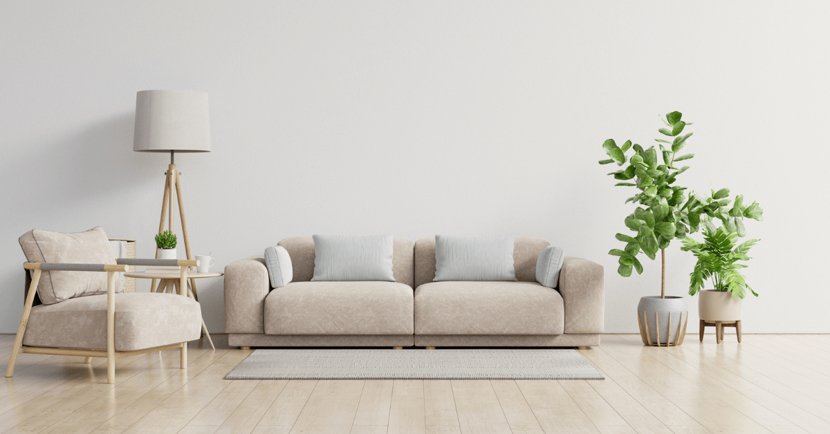
In interior design, negative space refers to the empty or unoccupied areas between and around objects in a room. It’s the breathing room that allows individual design elements to shine. While positive space is filled with furniture, decor, and other physical items, negative space is the open areas that provide visual relief and help define the overall composition of a space.
Why Negative Space Matters
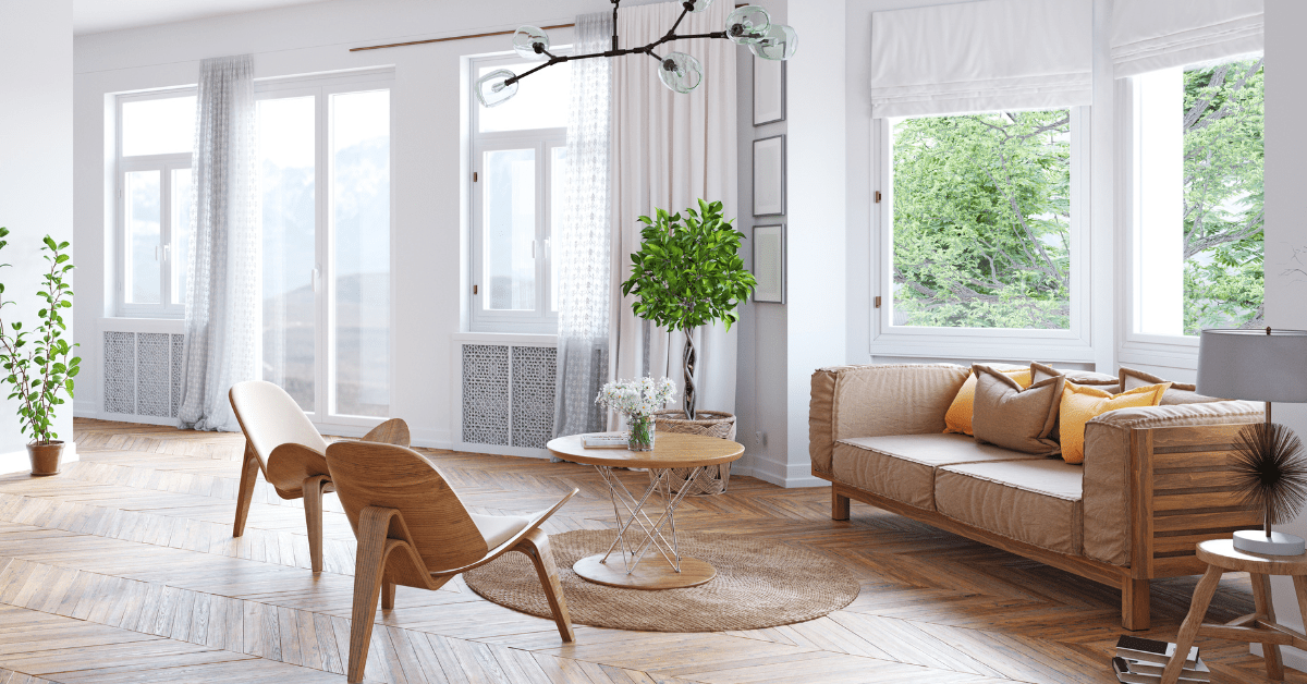
Negative space serves several important functions in interior design:
- It creates balance and prevents rooms from feeling cluttered or chaotic
- It allows the eye to rest and appreciate key design elements
- It improves flow and functionality in a space
- It can make rooms feel larger and more open
- It helps establish focal points and visual hierarchy
Without adequate negative space, even the most beautiful furnishings and decor can get lost in a jumbled mess. Mastering the use of negative space is what separates amateur decorating from professional interior design.
Creating Negative Space in the Living Room
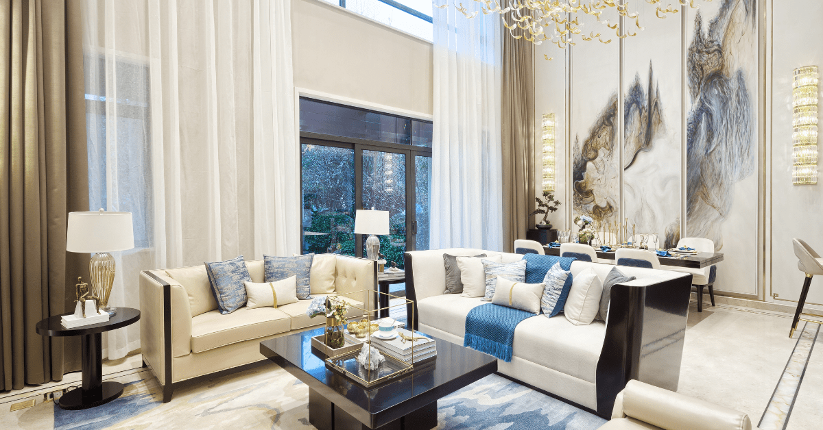
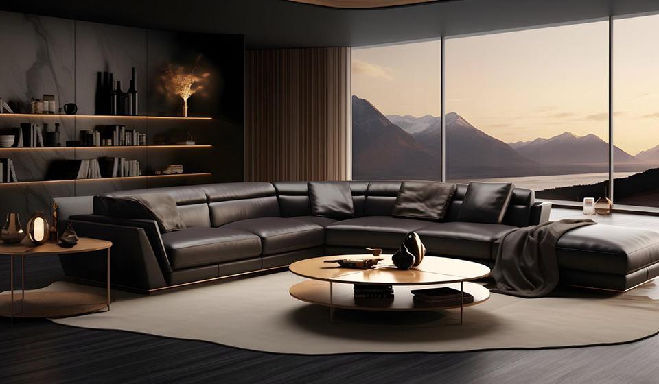
The living room is often the heart of the home, so striking the right balance of positive and negative space is crucial here. Here are some tips:
- Leave some breathing room between furniture pieces rather than pushing everything against the walls
- Create conversation areas with seating arranged to allow easy traffic flow
- Use a large area rug to define the seating area, leaving negative space around the edges
- Resist the urge to fill every surface with decor – leave some shelves and tabletops partially empty
- If using a gallery wall, leave generous white space around the frames
Remember, negative space doesn’t have to be completely bare. Even a minimally decorated area can serve as negative space compared to busier parts of the room.
Harnessing Negative Space in the Bedroom
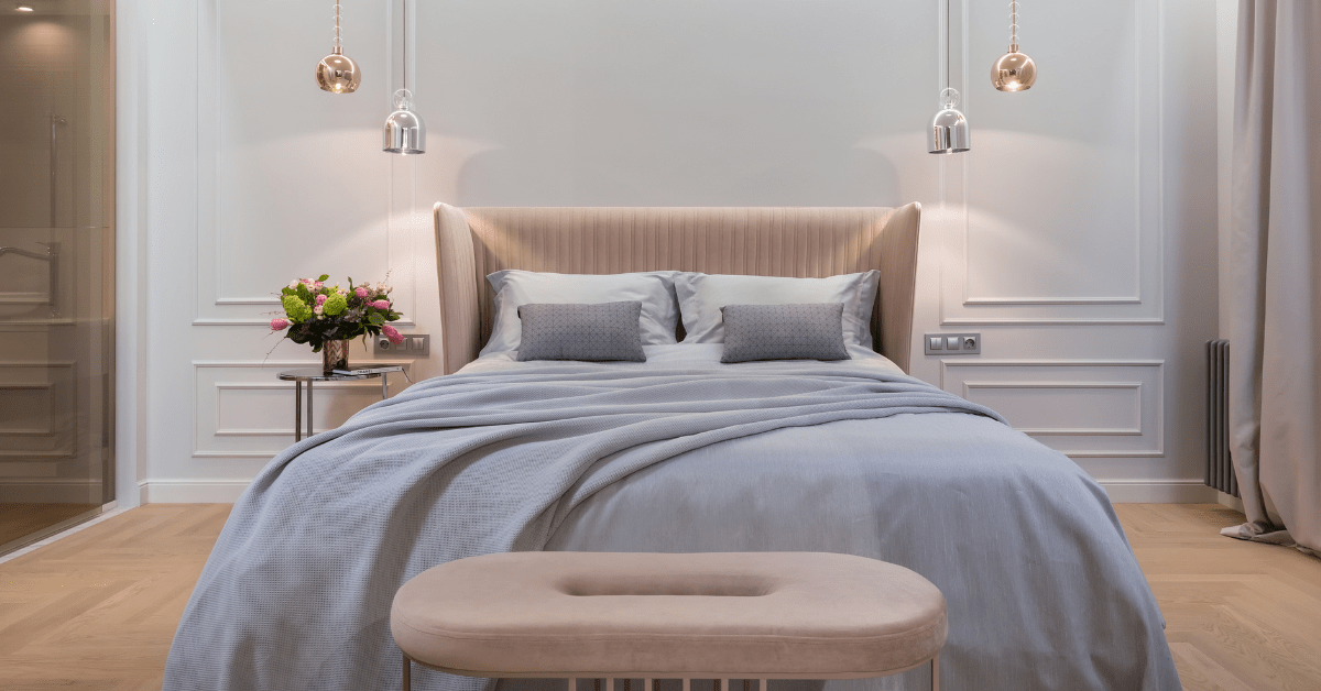
Your bedroom should be a calming oasis, which makes the thoughtful use of negative space especially important. Consider these ideas:
- Position the bed with ample space on either side for easy access
- Leave the area at the foot of the bed open to create a sense of spaciousness
- Use nightstands that are proportional to the bed – oversized ones can crowd the space
- If using a bench or ottoman at the end of the bed, make sure it doesn’t impede traffic flow
- Create a focal point with artwork above the bed, leaving plenty of blank wall space around it
The goal is to create a serene atmosphere that promotes relaxation and restful sleep.
Negative Space in the Kitchen
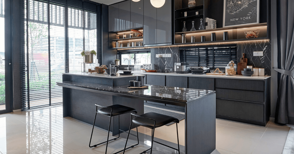
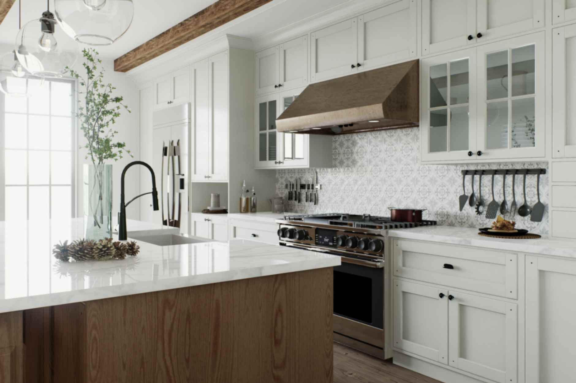
Kitchens are hardworking spaces that need to balance functionality with aesthetics. Here’s how to incorporate negative space:
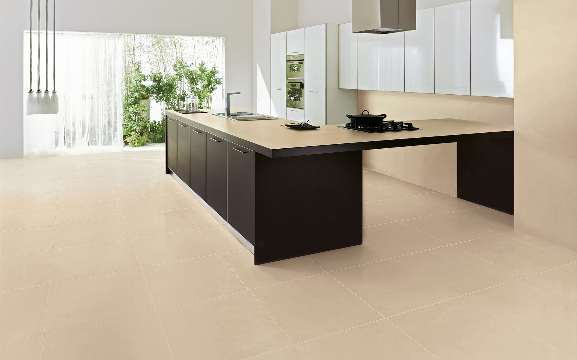
- Leave some open counter space rather than cluttering every inch with appliances and decor
- If possible, include an island with an overhang to create negative space below
- Use glass-front cabinets or open shelving to break up solid walls of cabinetry
- Consider a minimalist backsplash to provide visual breathing room
- Leave some blank wall space rather than hanging decor on every available surface
A kitchen with a well-planned negative space will feel more open and inviting.
Bathroom Design with Negative Space in Mind
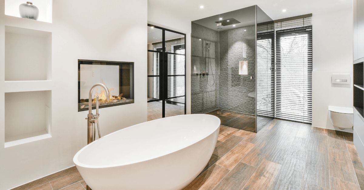
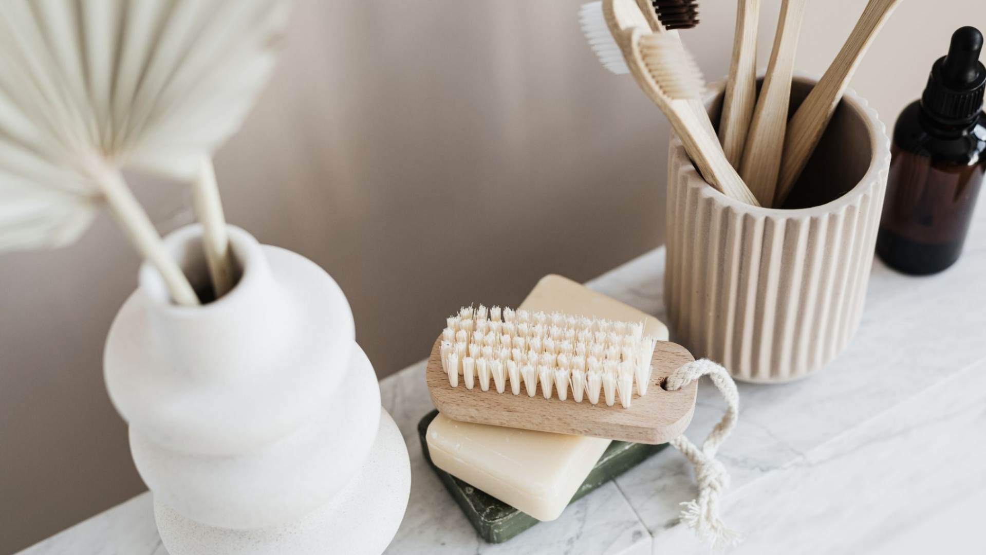
Even small bathrooms can benefit from the strategic use of negative space:
- Choose a floating vanity to create negative space below
- Use a frameless glass shower enclosure to expand the space visually
- Leave some open wall space rather than covering every inch with tile
- If space allows, position the tub away from the walls to create negative space around it
- Use a large mirror to reflect light and create the illusion of more space
These techniques can make even compact bathrooms feel more spacious and spa-like.
Utilizing Negative Space in the Dining Room
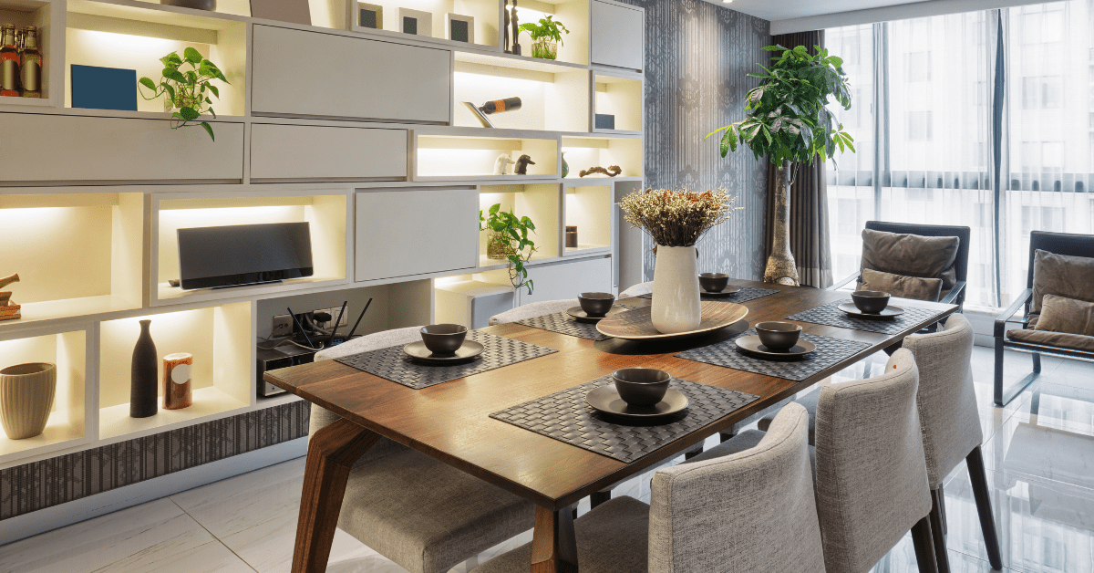
The dining room is all about gathering and conversation, so negative space is key:
- Choose a table that allows at least 36 inches of clearance on all sides
- Use an appropriately sized area rug that extends beyond the table and chairs
- If using a sideboard or buffet, leave some open space on top rather than cluttering it with decor
- Create a focal point with artwork or a mirror, leaving plenty of blank wall space around it
- Consider using armless dining chairs to reduce visual bulk
The goal is to create an inviting space that encourages lingering over meals and conversation.
Negative Space in Home Offices and Workspaces
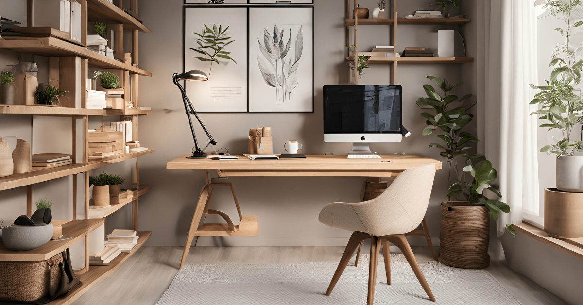
A cluttered office can lead to a cluttered mind. Use negative space to boost productivity:
- Leave plenty of open desk space for working
- Use floating shelves with some empty space between items
- If possible, position the desk to face a window or blank wall for focus
- Use a minimalist desk chair to reduce visual weight
- Incorporate plants to add life without cluttering the space
A well-designed home office with ample negative space can help you stay focused and inspired.
Outdoor Spaces and Negative Space
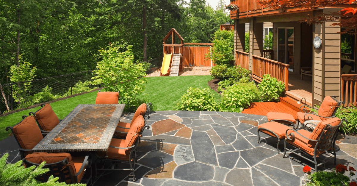
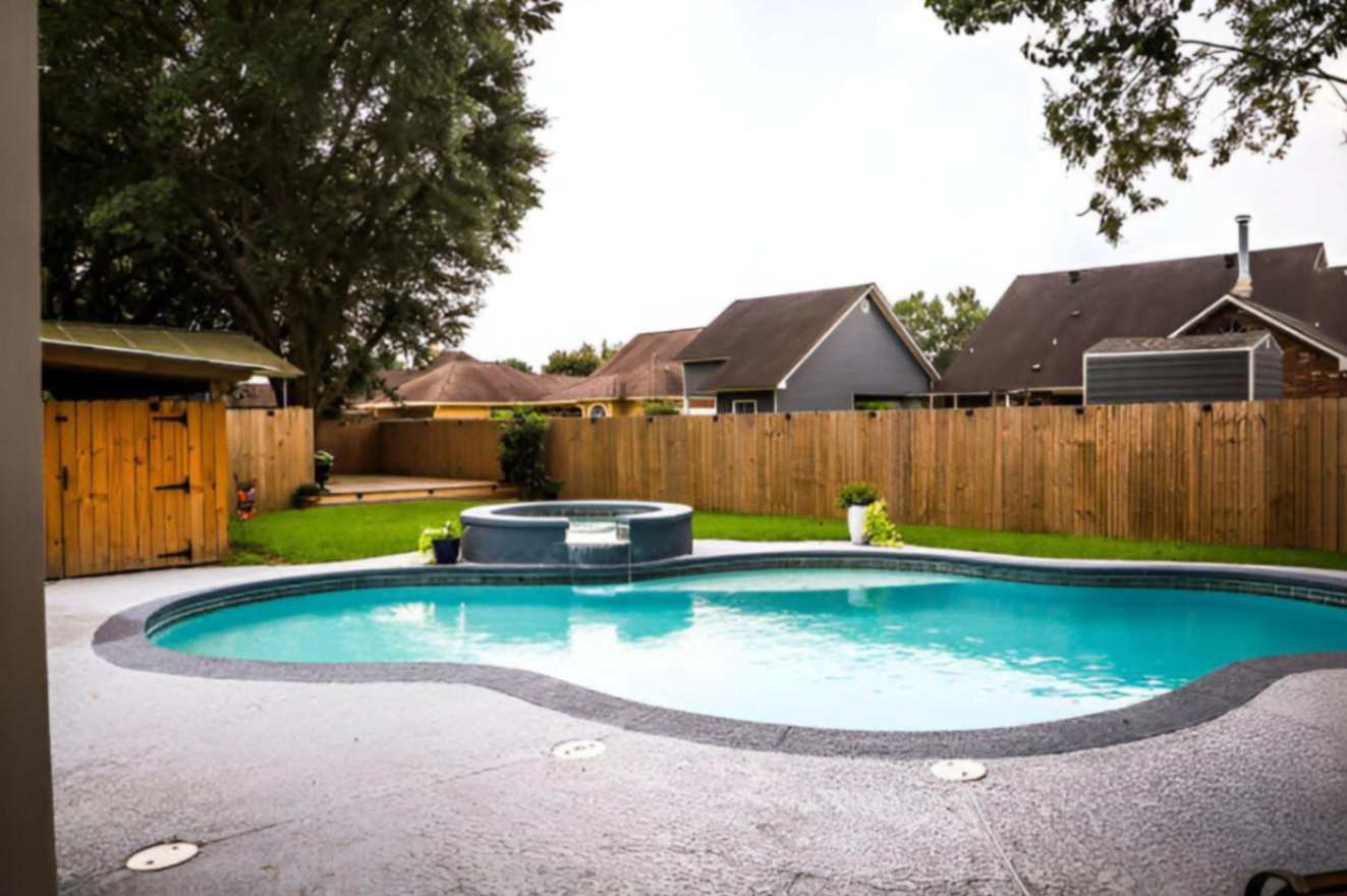
Don’t forget about negative space when designing patios, decks, and other outdoor living areas:
- Leave open areas for traffic flow between seating areas
- Use planters and landscaping to define spaces without overcrowding
- Consider an open pergola to create “negative space” overhead
- If using an outdoor rug, leave plenty of decking or patio visible around the edges
- Resist the urge to fill every corner with plants or decor
The goal is to create inviting outdoor rooms that feel spacious and relaxing.
Related Article: Home Stagers’ Secret Tips to Transform Any Room!
Remember, negative space isn’t just an empty area – it’s a powerful design tool that can transform your home. By thoughtfully incorporating negative space throughout your interiors, you can create more visually appealing, functional, and harmonious living spaces. So embrace the power of pause in your home design and let those empty areas work their magic.
You're reading How to Use Negative Space for Better Interior Design, originally posted on Decoist. If you enjoyed this post, be sure to follow Decoist on Twitter, Facebook and Pinterest.


